Wednesday 15 April 2015
Sunday 5 April 2015
Evaluation Question 3. "What have you learned from your audience feedback?"
Another way I got some more feedback, this time for my music
video, was by asking a friend of mine if she would watch my music video and
then give me some good points about it, and some bad points.
She is not a media student which was a difference from the
survey as most of them would have been media students. This meant that she
would represent a different type of audience and would let me know whether or
not my music video would reach out to a wider audience, not just to my specific
target audience. These images are
screenshots from our conversation, showing her opinion on my video: 

I agree with the points she made about the band putting more emphasis into their performance. But sadly because I asked her these question post production, it meant I could not make significant changes to my video, as the footage had already been filmed. However from this I have learnt that a good performance is key within a video, otherwise the audience will notice a lack in the performance. This could result in the video not being as effective in the ‘real world’ if it were to be aired on TV and YouTube etc.
However, overall I believe there were more good points then bad. She said my video looked professional and that it “fits well with the genre” this supports the comments of the audience in the survey. Which once again reinforces the fact of conventions being very important in the creation of a media product, because of the postmodern world we live in, things aren’t original, they are merely copies of each other.
The last bit of audience feedback I got was a video of my friend briefly discussing what she disliked and liked about my video.
Her view on my video is very similar to my friend in the
images above. But said differently. Jess
basically said she didn’t enjoy the performance part as much, whilst Kirsty
said she liked the narrative part more. From this feedback I have learnt that
because the performance from the couple was so much better and more believable,
it meant that the audience wanted to see more of it. If I had included more it
might have improved the video.
Kirsty also mentions the transitions between the black and
white and the colour within my video. The idea of including more colour into
the bands performance came from feedback given to me by my media teachers. By
doing this it has increased the effectiveness of my video and attracted the
audience more to my final music video. There is one main criticism of my audience feedback that could have effected or hindered the results, and that is the fact that everyone that I used would have ranged between the ages of 16-19. This means that the results could be seen as quite biased towards one age range. It also means that I cannot test whether or not my final product and ancillary texts would appeal to a range of ages.
Saturday 28 March 2015
Evaluation Question 2. "How effective is the combination of your main product and ancillary texts?"
Throughout the creation of my media product and ancillary
texts, it has been crucial to make sure that in some way they all link together
so they are identifiable and easily recognised by people, so they can see that
each text are all for the same product. However to make sure this house style
and cohesion didn't get boring it was important for me to change certain things
within the different products but also to add similarities.
A big part of my three products in making them link together
was the use of colour and fonts used within and throughout them. This
similarity between the fonts and colours connected the products together and
resulted in the continuity between each text looking effective and easily
identifiable. The running colour theme was mostly black and white. This is
shown in these images:

Hopefully to the target audience this would show that the “Little monster” throughout the texts, especially the music video, is the man who is shown in the narrative.
The parts that are highlighted on the image above are the different parts of my ancillary texts and music video which I think combine effectively together to show the running them throughout all three products. These highlighted parts show how I have entwined colours and black and white into my music video and ancillary texts. This shows a clear style that has been created in the products which represent the style of music and the intention of the song. A very strong way in which I have combined all of my products together is the inclusion if screenshots from my video onto both the album Digipak and magazine advertisement. I believe this shows a clear link between them all and shows the target audience that they are all connected in some way.
On the other hand there are some improvements that could have been made to ensure that there were more links that connected all of the products. As I wanted the album cover to have some mystery to it, I decided to use a different model for the image on the cover. I thought that this would confuse people and would stand out from other conventional album covers.
Once again talking about how the genre is linked together throughout the products is the name of the album and the songs on the album, which reinforce the genre of music. As the genre is rock it was important for me to keep that theme running through each product. It was easy to do in my music video because the song it the main focus, however I also needed to make sure the location and outfits also fit, especially in the band performance. This is the reason for the warehouse, I chose this location because it looked dark and run down and it isn't a fancy setting which is usually used in pop videos.. This theme was then shown in the ancillary texts; by using a brick background on the front and back cover it reinforced the rock theme. Brick walls could be associated with graffiti which would show a rebellious side to the album. The ancillary texts are then connected because I used the same image for both the album cover and the magazine advertisement, only making a few changes on the advertisement.
In conclusion I believe that the similarities in my media product and ancillary texts lead to them all linking together effectively. The use of the black and white and then orange/yellow colours in my video and ancillary texts connects them all together and leads to a visible clarity between the products. There are some ways I could have changed the three products in order to make them more coherent, such as including more images of the band as they will obviously be the main focus of the album. However overall I believe that they all work effectively together and the differences with each of the texts leads to a more effective house style and it means that it will link well with the other “songs” that would be on the album if it was going to be sold as a real product. As if it was going to be sold as a full album the album would not just base the style on one song/ video from that album.
Friday 27 March 2015
Evaluation Question 1. "In what ways does your media product use, develop or challenge forms and conventions of real media products?"
In this slide share presentation I have discussed how throughout my three media products: which is the Album Digipak, Magazine Advertisement and Music Video, I have used, developed and challenged the conventions of real media products. Each product links together in a specific way to create cohesion and a house style that runs through the three different products.
Thursday 26 March 2015
Evaluation Questions
After finishing my final product of a Music Video, Album Digipak and a Magazine Advertisement. There are a series of questions that I need to answer to evaluate this years work. This is used to test my knowledge and to see where I could have improved and where I did a good job and creating a professional looking and effective product.
These questions are:
These questions are:
- In what ways does your product use, develop or challenge forms and conventions of real media products?
- How effective is the combination of your main product and ancillary texts?
- What have you learned from your audience feedback?
- How did you use media technologies in the construction and research, planning and evaluation stages?
Wednesday 25 March 2015


Tuesday 24 March 2015
Sunday 22 March 2015
Saturday 21 March 2015
Photoshopping: Album Cover


I then opened an image I had got off of Google and put it on Photoshop, I then cut around the part of the wolfs face that I wanted with the lasso tool, on the toolbar and then dragged it onto the cover. Firstly when I was thinking of ideas for the album cover I wanted a wolf face merged with the model because I thought it would fit with the theme.

I zoomed out to look at the full image and wasn't too sure whether it looked effective or not because it hadn't merged the way I wanted it to look.
Friday 20 March 2015
Second Full Draft
Since the first full draft of my music video I have made a few changes in order to improve it and make it look more professional.
When I was first editing my video I wanted to make it so the bands performance was in black and white, whilst the narrative side of the video would be in colour. This I thought would be easier for the audience to see the contrast between what was real and what was pretend and would result in a good media product.
However because the bands performance takes up most of the video it means that a lot of the footage is in black and white and does begin to get a bit boring, meaning that the audience may lose interest as the video goes on because a lot of the shots are very similar.
So to improve on this I thought it would be best to add more colour within the black and white shots to add a bit more variety to make the video more interesting. I also added a few more edits such as Blurs and Cross Dissolves to add more excitement and a faster pace to my video.
It also came to my attention that the first shot of my video was far too long and had to be shortened because it went on for too long and looked very plain, it also didn't match the pace of the beats and instruments in the song. So I included a few more shots within that long clip such as close ups and flashes of colour, which definitely improved it.
The colour changes I have added do improve the video a lot. However there are still things I believe need improving in order to make it even better. There are a few shots where I think the flashes of colour don't look very good and so I want to take some of them out because I don't want them getting boring as well.
Thursday 19 March 2015
Improved Magazine Advertisement
I did a quick questionnaire to ask a few people what they thought of my magazine advertisement and what improvements they thought could be made to make it look better. I have taken some of these improvements into consideration and have changed the advert slightly.

Here are some of the peoples responses to my magazine, and the changes that I have made in order for my advertisement to be appealing.


Here are some of the peoples responses to my magazine, and the changes that I have made in order for my advertisement to be appealing.

Friday 13 March 2015

Magazine Advertisement In Real Surroundings


Thursday 12 March 2015
Wednesday 11 March 2015
Exisitng Digipaks


The main image on the front cover takes up most of the space. The name of the band or artist is in a bold font and is also quite large, making it easily recognisable. Frequently if there is an album name it will be smaller that the artists name.
The image used on the disk is usually quite simple and will fit with the theme that runs throughout the rest of the album Digipak. The colours and font used on the Digipak give a good interpretation of what genre of music it will consist of.
For example rock genres may prefer to use darker and plainer colour throughout and bold fonts. The simplicity of them is usually what makes them more effective.
Whilst pop and other genres may go for more bright, outstanding colours and possibly more diversity with the fonts used.
Album Cover Drafts


As I feel there is a dark side to this 'Album' I thought it might look good if I merged a human and a wolf together, showing the dark and animalistic side of the songs. However I am undecided between these two drafts because I don't know whether to include both the wolves face and the shadow or just the shadow.
Once I have decided, more detail will be added to the album cover.
Tuesday 10 March 2015
Merging Photographs
For my album front cover and magazine advert I wanted to merge two photographs together. However my previous experience with working with Photoshop didn't need me to merge images. Therefore I didn't know exactly how to do it, and when done correctly it can look really good.
So I thought it would be a good idea to watch videos on YouTube to see how it is achieved.
After watching this video I have realised it's not that complicated and can be easily done with a little bit of practice. The reason I want to merge two images together is because I feel it will look more interesting and eye catching for the reader, and it will also suit the genre of the song really well as the 'rock' genre of music usually has different styles than other popular genres of music.
First Full Draft
This is the first full draft of my music video. I am happy so far with the video, however there are still quite a few improvements that need to be made in order for it to be better. Such as making some shots shorter, because of the fast pace of the song the cuts and edits also need to match that quick pace in order for it not to get boring or repetitive.
Saturday 7 March 2015
Album Design and Magazine Advertisement: Test Fonts


Before creating my Album Front cover, I thought it would be best to look at some styles of fonts that would look professional on my front cover and that would fit with the genre of music and the overall house style I want for all three media products. As the song, music video, and band are of the indie/rock genre I looked at more bold and masculine fonts. Which would result in a professional looking album cover and would hopefully stand of to the target audience as a indie/rock album.
Out of the eighteen fonts, I have put a box around the four I like the best. I chose these ones because I feel they fit better with the genre and are nice a subtle but also stand out. I also really like the way the font looks a bit like graffiti and a bit run down. This reinforces the stereotype of the rock genre breaking the rules and going against the norms.
Friday 6 March 2015
Thursday 5 March 2015
Existing Album Covers: Pop Conventions


These album covers are completely different to the rock and indie rock artists album covers. It is clearly shown that their ideologies are completely different. These albums, especially the female artists at the top are all really similar, all showing a close up of their faces, pulling a sexual face that will entice and male audience as well as a female audience.
However I do like the black and white effect used on some of the covers as in my video i do have a lot of black and white scenes so it would fit in well.
I also really like the font that is used on Niki Minaj's 'Automatic'.
Because these are pop artists their look is really important when selling their products and that's because their image is what is used to market them and bring in a large scale audience.
Pharrell's album cover in the bottom right corner supports Laura Mulvey's 'Male gaze Theory'. This is because he has girls included on his album cover who are basically acting as 'objects' to be looked at. Also as a way for him to look more powerful to the audience and to attract a wider male audience because they might feel some jealousy towards him.
Existing Album Covers: Rock Conventions


The album cover for Linkin Park's newest album "Hunting party" in the top right corner is different to 'typical' album covers that you see. I also think the art work on the cover is creative and effective. The use of this artwork moves away from the typical conventions of what a stereotypical album cover should look like. The dull colours used are similar to the colours I am wanting to use when creating my album cover for the song. I believe they will fit in well with the genre of music and will look really good with the type of images I am wanting to take for my ancillary texts.
I liked the font on all of the album covers and also the originality of them. Usually album covers like the Fall Out Boy one in the bottom left corner aren't seen which it was makes it stand out. The reason I chose these album covers to look at because I want mine to look as original as I can. I also think they fit in with the genre of my song, sticking with the 'rebellious' or different stereotype that the rock genre of music has. Therefore it is helpful to look at them because it will help me to get an idea of what I want before definitely committing to one idea.
There is a running theme throughout all of these album covers and that is the fact that none of them show the artists on the cover. This is very common in album covers for rock or indie bands. Possibly as a way of them stating that their main focus is on making music rather than trying to promote themselves, also a way of trying to be different from other genres of music such as pop artists who most likely will always be featured on their album cover.
I like the idea of not having the artist on the front cover as it adds a bit of mystery and it means that the audience buying the album wont base whether or not they buy it on the band of artists looks rather than love of their music.
Having artwork on the album cover I think is very effective and looks really good. It is definitely something I will try out when testing ideas out for my album cover. As i feel it is different and would really attract my target audience.
Wednesday 4 March 2015
Tuesday 3 March 2015
Wednesday 25 February 2015
"Frozen In Time" Effect
There is a point in my music video where I wanted to include a freeze frame, to add more effects and to make it look more interesting. I went onto YouTube and found some ways in which i can achieve this. The first video shows a very effective way of doing a freeze frame and it looks realistic, that is how I would want mine to look in the music video, however because I don't have the expensive resources needed to create a vivid freeze frame I found a low budget way of doing it, which is shown in the second video. Although I doesn't look as effective as the first one I think it would still look good in my video. I will be combining both ways of doing the freeze frame effect to make it look the best I can.
Friday 20 February 2015
Draft: Band Performance
Many problems occurred when trying to find a band to performing in my video. The first band I found ended up not doing it which put me quite a bit behind. Ive recently been able to film, however because i this set back I wasn't able to create a full draft of my music.
This video is most of the bands performance in the music video. I am happy at the moment with this section of this video however it is clear that there are still improvements that need to be made.
This video is most of the bands performance in the music video. I am happy at the moment with this section of this video however it is clear that there are still improvements that need to be made.
Friday 13 February 2015
Text Organisation With Different Band
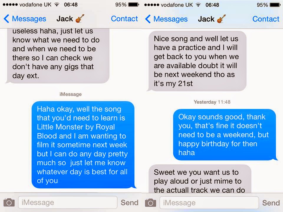

After the problems I had with the last band I was going to use, I finally found another band who were willing to be in the music video.
These are a few texts that shows the organisation between me and one of the band members. Discussing the song they need to learn and the location where we will be filming. As they are a real band they are perfect to use in my music video, they have past experience which means they will be good at performing and will look very professional. They also all can play the instruments that I wanted which will help towards the video looking good and professional.
They all have the equipment needed which helps a lot as it means I want have to hire or buy and props or equipment.

Thursday 12 February 2015

Monday 9 February 2015
Digipak Template

Thursday 8 January 2015
Filming In Slow Motion
In my music video I will be including quite a lot of slow motion shots in it. In order to get the best quality slow motion shot that I can, I thought it would be a good idea to look at some tutorials on Youtube on how to film in slow motion.
This really helped as it showed me the best way to get a good quality picture when wanting to film in slow motion. The tutorial below shows the man using a EOS 7d which is a different camera to mine, however hopefully my DSLR camera will have similar settings to the camera used in the video.
This was just a short video for beginners, nothing to advanced. I watched this video to get the basics of filming in slow motion.
I also watched another video on filming in slow motion that included similar information. However it was a bit more instructive than the video above and also went in to more detail which made it very helpful.
The good thing about this video was also it showed how to add the slow motion to the video whilst editing the video instead of on the DSLR camera. This gives me a different technique of filming in slow motion just in case one way doesn't work very well.
Monday 5 January 2015
Filming Problems
There have been quite a few problems with filming my music video first draft. The main reason for these problems was not finding good locations, or problems with the whether but actually the actors themselves who I had asked to be the band within my video.
At the start of the year I asked them if they would do it and they said they would. Countless times I had reminded them to learn the song and to make sure they definitely would do it, which they kept agreeing to.
I asked around for locations and managed to get my dad's good friend to allow me to use the warehouse where he worked which was near enough the perfect location that I wanted for my video. As the band performance is the main focus of the music video I thought it would be a good idea to make this the more prioritised part of my video. I made sure I organised and told them everything that was going to happening.
Once I had organised it for the specific day I made sure they all knew, as they didn't say they couldn't do it I believed they all could. However on the day one of them decided they couldn't do it and didn't think to tell me. So I had to rearrange the day of the location and made sure once again they all knew.
This day was my last chance to film so I made sure they knew how important it was, then I came to realise on the day we were meant to film again that they hadn't even learnt the song and therefore I could not film again. Which ended with me not having any footage for my first draft.
This means I now will need to find new actors to use in my video, in order to get these new actors I will send emails to all students asking for volunteers so then hopefully I will be able to trust them, and create a good and professional looking music video.
Subscribe to:
Posts (Atom)